
“A thing of beauty is a joy forever”
John Keats would not have known how important this verse would turn out for digital content. For the simple reason that visually pleasing website design is the hallmark of a high conversion rate.
Now, you might wonder what does visually pleasing website design even mean? I will tell you that it means more than an aesthetic background and a clever logo. It is composed of a whole bunch of tricks, that let the users interact with your website much more easily and improve the chances of them contributing to your goal of higher conversions.
Working at a reputable web design agency India, I have handpicked these must-know pointers to help you gain an insight into how design can really change the game for you.
So let’s take at what all things we got here.
1. PAINT IT WISELY
Unlike abstract art, website design needs a strict color combination that helps the reader understand your product or service easily. You’ll find examples of this trick all over the internet. Amazon’s online store, for example, has a very balanced color scheme and they have intentionally kept the colors of the “Buy Now” and “Add to Cart” buttons in coherence with their logo’s color. This strategy automatically suggests the visitor what he has to do in order to buy something, which makes the whole idea of navigation effortlessly simple.
More inspiration can be taken from Google’s Material Design. It uses a color palette that very easy on the eyes and yet lively at the same time. If you notice carefully, they use multiple variations of the same color linked to a specific section instead of using painting a rainbow on the screen. The user can easily draw a contrast between various segments and yet feel comfortable with the over-all coloring scheme of the website.
Get Material Design Lite for your website from here.

2. DON’T BREAK THE FLOW
Once you have got your user amazed by an intelligent coloring scheme, the next step would be to make it easy for the user to explore your content.
This is one of the biggest issues you can face with the design. I have described it earlier in my blogpost about 6 Mistakes you are making on your website and would like to repeat it again, to lay emphasis on the importance of a flow structure.
A brilliant way of understanding the user flow is given in the Google Analytics panel.
If you have ever seen a series of dominoes, you’d already know what flow means. When you push one piece of the dominoes series, the rest follow the same pattern until all of them have fallen down. In the same way, your website’s structuring should be done in a way that one section follows the other and the user can easily ride the flow as the user makes moves on the website.
Segments such as the “subscribe now” button and “Contact Us” should be carefully placed inside this flow so that the user doesn’t have to struggle to get you. As easy you make it for the user, as easily the conversions would roll out for you!
3. MAKE THE CONTENT EASY TO COMPREHEND
Are you aware of the term called the F pattern?
Let me shed some light on it. In the popular NNGroup eye-tracking study, it was revealed that users follow a simple pattern while reading your website. The path that a typical user’s eyes follow looks like the alphabet ‘F’ and tell us a lot about how you should design content on your website.
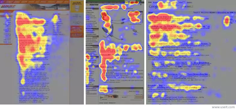
How to practically apply this pattern?
- Place the most important bits of information on the hotspots as shown in the above image.
- Use call to action keywords lower down the page and place them at the beginning of the sentence.
- Summarise the valuable portion of your content in the first two paragraphs.
- Clearly, separate the content that you feel is okay to be missed out by the reader.
In addition to this, you should always try coming up with smaller paragraphs that don’t feel like a burden to read.
Use the art of persuasion in your language and write catchy titles.
Make the content ride a balance between informal-to-read and educationally-accurate.
4. LARGER FONT, BUT NOT TOO LARGE
Choosing a good font size is nothing less than a rope-walk over the potential danger of pissing off readers. But if done right, an optimal font size can be the simplest thing that’ll work wonders for you.
Marketers like Hubspot have clearly stated it that font size should be decided in a neat proportion to the number of words you’d be displaying in a given space. A good paragraph length lies between 50 – 70 words and for this much content, a larger font size works the best. It helps readers absorb the information easily and tends to negate the white space efficiently.
You already know the SEO advantage of H1 and H2 title tags. Now is the time you use them for the visual benefit and include them frequently with longer paragraphs. It’ll keep the user interested as they focus on the keywords.
5. USE THOSE EYE-CANDY INFOGRAPHICS
If you are aware of the power of infographics, you won’t be surprised to know that;
“Eye-tracking studies show internet readers pay close attention to information-carrying images. In fact, when the images are relevant, readers spend more time looking at the images that they do reading text on the page.” – states another study by the NNGroup
The fact is self-explanatory that you must focus on making your content as visually interactive as possible. It can communicate with the readers at a level that text can never reach and makes use of the human tendency to pay attention to visual stimuli to a great advantage.
Also, infographics get 3X more shares on social media. Sweet, eh?

6. DESIGN OF THE CALL TO ACTION BUTTONS
As discussed in the second point, your CTAs should be accommodated well within the flow of the user. Next is, how to make them very clickable.
Here are some key ideas for making click-friendly CTAs
- Use contrasting colors for CTA buttons that are easy to distinguish.
- Use short and compelling text for the CTA Buttons.
- Invest time on button graphics and see which design works the best for them.
- Don’t be afraid of animating the buttons a modest bi to make them stand out
- Finally, place them at the hotspots we determined earlier
7. MAKE NAVIGATION EASY
This is the most obvious thing a web designing agency treats in the most un-obvious way. The navigation. While everyone comes up with great ideas for their design, almost everyone forgets to make their navigation system easy to follow for the user. This can depend on your website’s development environment as well. I have mentioned some useful tips for PHP vs. .NET debate here.
The goal of your website’s navigation is this:
“Minimize the user’s journey to the page where the conversions take place.”
Now, this can be achieved by one or a combination of the following ways;
- Lay out the main navigation menu in an uncluttered way
- Use arrows and guiding pointers that lead to converting pages
- Make fewer things available on the very front, keep the user curious
- Make sure the navigation works smoothly on the mobile site as well
8. ARTICULATE YOUR SERVICES PRECISELY
This is a general guideline for every website out there on the internet. Specify who you are, what you do and how you can add value to the user in a well-comprehensible way.
While you are at it, make sure you articulate the whole process. Make luring about us pages that identify you as a professional in your field. Make a resource page on the website that elaborately describes all your products and services. Make pop-hover tool-tips for the parts of the website that the reader may find difficult to understand. Lay great stress on your language for all these things.
9. MAKE THE FUNCTIONALITY OBVIOUS
The world is a diverse place and something that is obvious to you may not be to the user. Therefore, there is an immediate need of making your web layout very obvious to use as well as understand.
You can take inspiration for iOS’s design. Everyone says that even a dumb person can use it. Why, because it is very obvious to use. Same thing applies to your project. Try adding the CTAs in the front and not in un-obvious corners. Reduce the number of clicks needed to reach the landing page where conversions happen and test your design on as many users as possible to gain an insight into its level of obviety. (obviousness). This will take your conversion rate uphill and help you hit those magic numbers.
10. MOBILE RESPONSIVE
Did you know that “mobile and tablet devices accounted for 51.3% of internet usage worldwide in October compared to 48.7% by the desktop.” Statcounter stated in their research. This makes it more than necessary to get a mobile-optimized version of your website. It is not a tough thing to do but it needs some considerations:
Don’t put a lot of features on the mobile site. Over-cluttering the little screen can be a put-off. Make it modest yet usable.
Use overflow menu’s for the website that saves you space for showing more prioritized content.
Make your navigation buttons mobile friendly as well. (Important!)
Try the Google Mobile Website Analyser Tool to get useful guidelines for it. It really helps.

11. USE FACES
It is a great idea to introduce human faces on your website. Not only it gives a human touch to your design, it also helps the user to overcome the monotony of text and images.
The famous marketer and SEO specialist, Neil Patel has used his pictures throughout his website, which tells us the importance of this tactic. (He is big!)
If you’re camera shy, you can use client testimonials on the website and post their faces on the website as well. It communicates a goodwill, see more about this point in another informational post here – Why Testimonials are important. Apart from this, you can make animated videos or video tutorials aided by a person speaking in the frame, which instantly connects to the user at a deeper level.
At last, if you have queries or opinions for this post, kindly reach out to us at.
We are one of the best web design companies in Chandigarh is what our clients say about us. Here is some evidence for it.
Bless you, with high conversions!